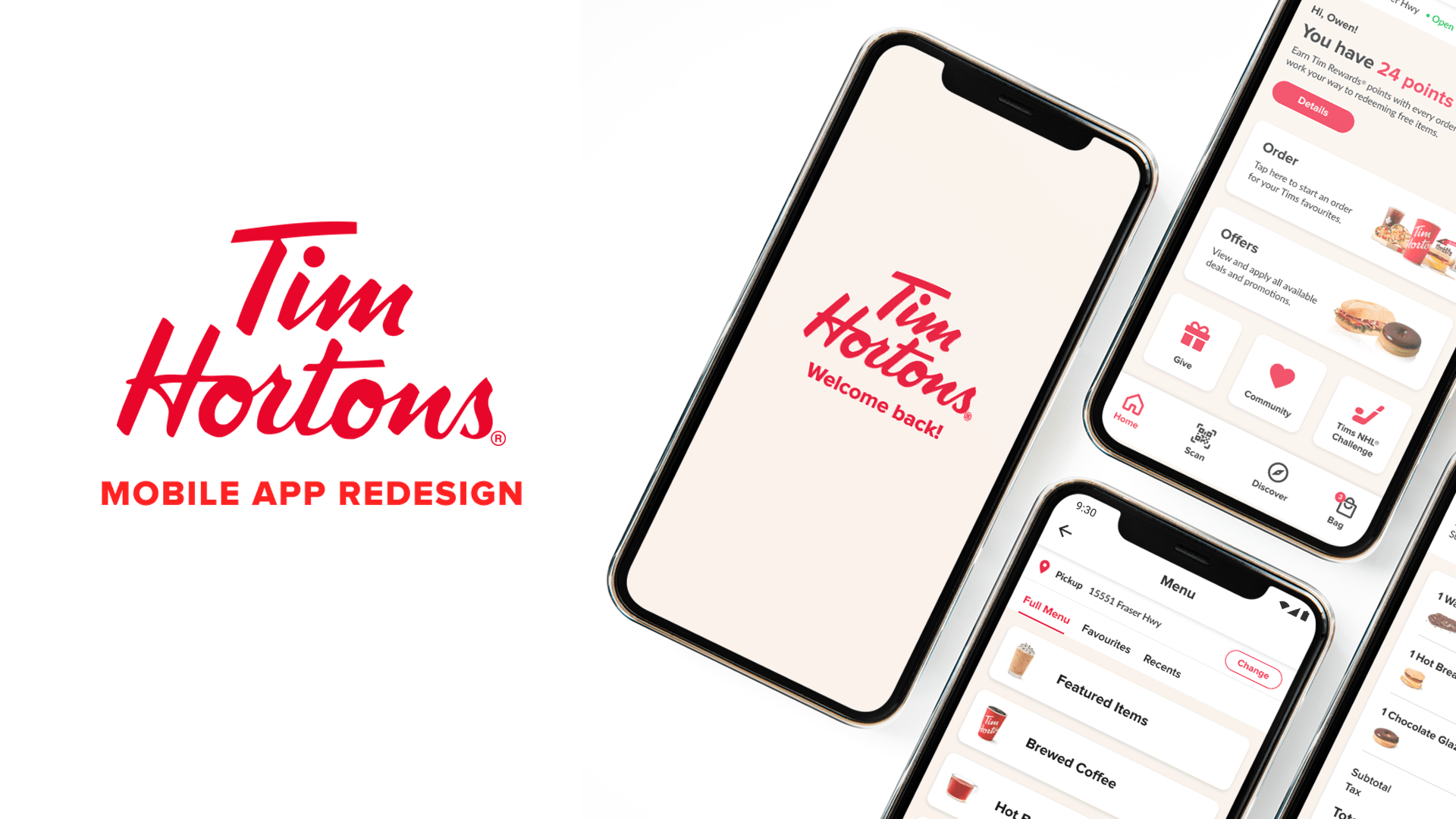
Tim Hortons is a renowned Canadian coffeehouse and restaurant chain known for its coffee and doughnuts.
Despite their current mobile app being relatively clean in terms of visuals and UI, issues with hierarchy and usability can still be found. Returning users have experienced problems such as poor overall navigation and difficulties with the ordering process.
As such, my main goal with this project was to not only re-style and enhance the layout/readability of the app (homepage, menu page, bag page, payment page, review page) but improve some UX components as well. To do so, I attempted to uncover any hierarchical issues and UX redundancies, specifically in the ordering process, and propose potential solutions.
Done as a part of a UI/UX program at the British Columbia Institute of Technology (BCIT).
This case study may contain copyrighted material the use of which has not been specifically authorized by the copyright owner. This case study has helped me to promote my capabilities and advance my education specifically in the area relating to user experience (UX) research and includes my personal opinions, satire, criticism and review. I believe this constitutes a ‘fair use/dealing’ of any such copyrighted material.
Tools used include Figma and Adobe Illustrator.
What are the problems with
the home screen and what are some potential solutions?
the home screen and what are some potential solutions?
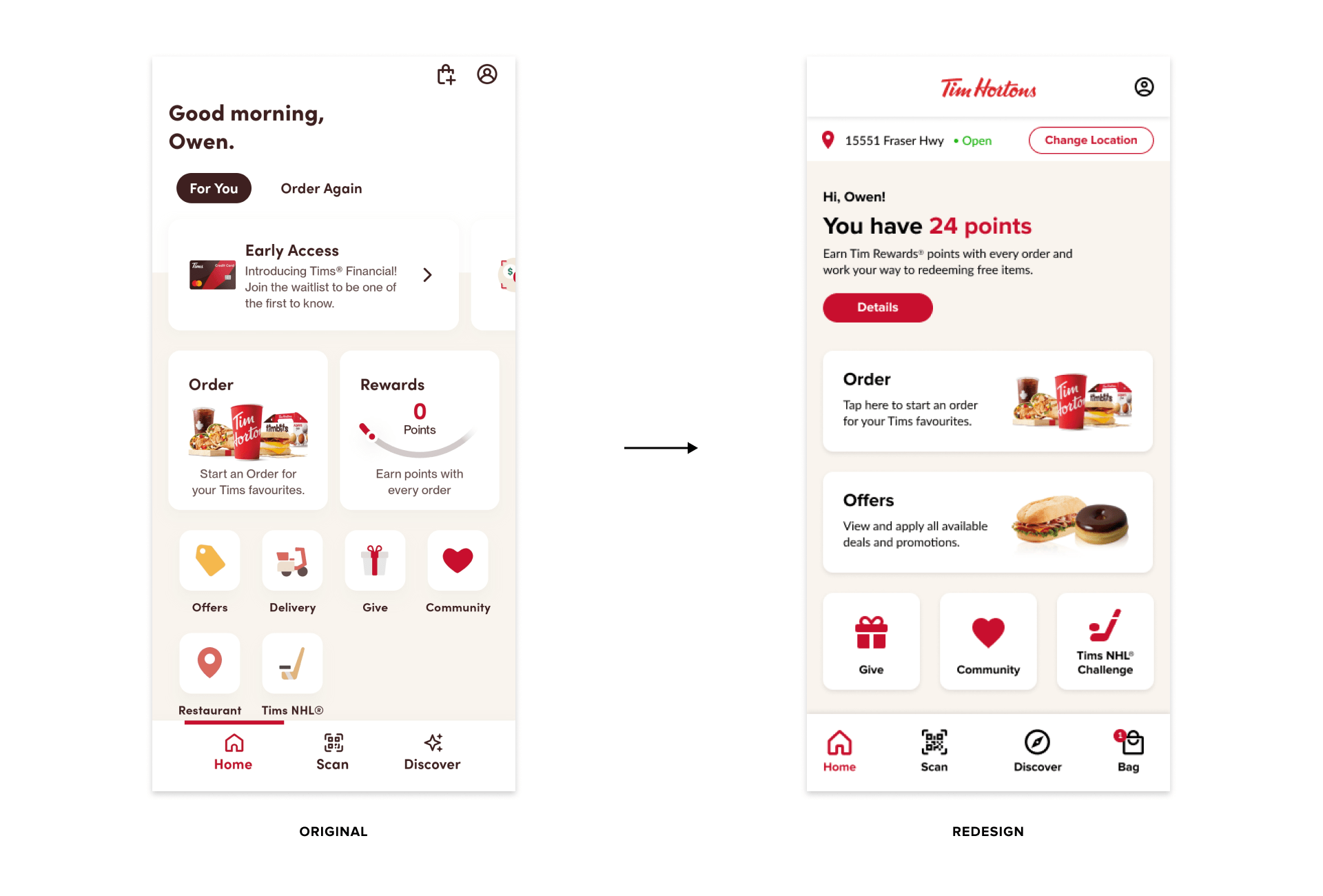
Pinpointed problem(s) on the current Tim Hortons app home screen:
1. The “Order” and “Rewards” tabs displayed on the homepage could still use a bit more hierarchy to emphasize them a bit more; they are essential parts of the app but are still listed underneath promotional tabs that may just be ignored. "Offers" could use a bit more hierarchy as well, as it seems more important to the user than the features it's grouped with.
2. The tabs after “Early Access” are “Scan & Pay!” and “Discover”, which are already listed in the bottom navigation bar. Is this redundant? Is it also redundant for "Delivery" to be a tab if you can choose delivery once pressing "Order"?
3. The cart (bag) seems like it should be a part of the global navigation (bottom bar) due to its importance, but it's not.
Proposed solution(s):
1. A quick summary of Tim Rewards points has been put up front so users can instantly know how many points they’ve built up. The “Details” button leads to the Rewards page displaying all related information.
2. The hierarchy of “Order” and “Offers” was increased due to their importance compared to the other features (ex. Give, Community, etc.)
3. The cart (bag) icons/feature was added to the bottom global navigation bar so users can access it from any page.
4. The saved restaurant location has been put at the top for easy access/view (previously a Restaurant Locator tab).
What are the problems with
the menu screen and what are some potential solutions?
the menu screen and what are some potential solutions?
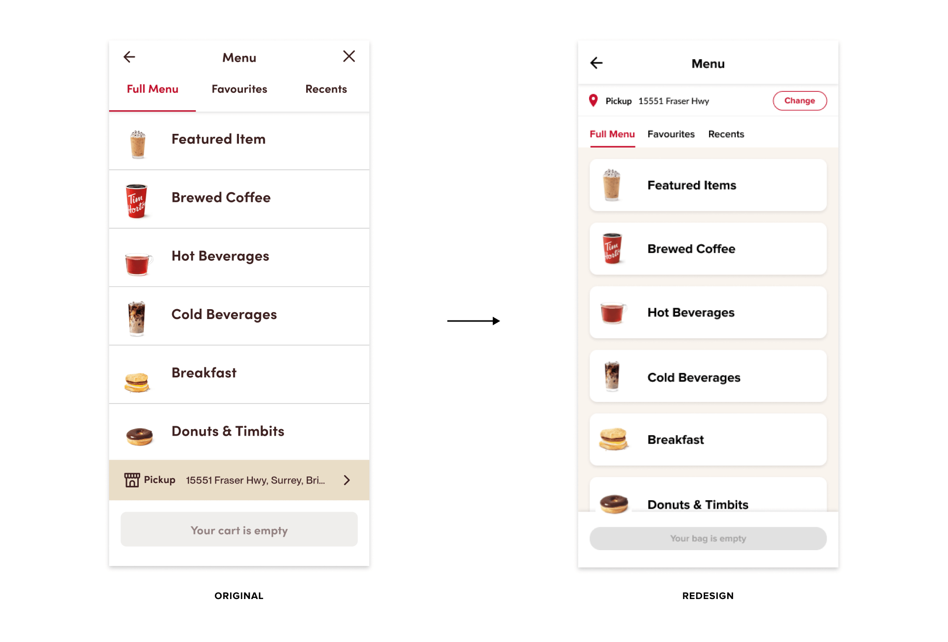
Pinpointed problem(s) on the current Tim Hortons app menu screen:
1. The menu page for their app has a relatively clean UI design, but could the location/service bar be explored to be put at the top rather than the bottom, and made a bit clearer so that users can change it when clicking on it?
Proposed solution(s):
Proposed solution(s):
1. The top restaurant location bar has been put at the top and includes whether the user wants delivery or pickup. A "Change" button has been substituted for a right arrow button to make it a bit clearer that clicking will redirect the user to the page the app currently has where they can select the location and service.
2. The layout redesign itself is similar to the original but it has been changed to a card layout to stick with consistency with the redesign of other pages.
2. The layout redesign itself is similar to the original but it has been changed to a card layout to stick with consistency with the redesign of other pages.
What are some problems with
the cart screen and what are some potential solutions?
the cart screen and what are some potential solutions?
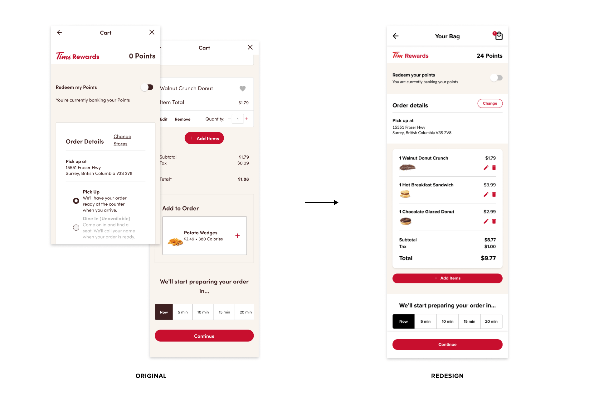
Pinpointed problem(s) on the current Tim Hortons app cart screen:
1. There is a good amount of white space surrounding the "Redee my points" section of the page...maybe too much?
2. The "Order Details" box has a bit of a clunky layout. Can this section be re-designed so it “flows” better?
3. Why is there a white box splitting the items from the total price? And is it possibly a redundancy to have an "Add to Order" section if there’s already an “Add Items” button above it?
Proposed solution(s):
1. The white space was reduced in the "Redeem your points" section.
2. The "Order Details" section has been redesigned and reorganized by getting rid of the option to “Pick Up” or “Dine In” due to “Dine In”’ being unavailable and “Change” bringing the user to a page where they can change their preferred service option. As such, having the aforementioned option seemed a bit redundant.
3. For the actual cart section, the edit/remove buttons have been changed to icons. The “Quantity” option has also been removed due to possible redundancy with “Edit”. An image of the item is now displayed and the subtotal/total prices have been combined in the same white frame as the listed items. This is so that the items look and are grouped.
4. The “Continue” button is now in a fixed position at the bottom of the screen to help with navigation and efficiency by (hopefully) reducing scroll time.
What are some problems with
the payment screen and what
are some potential solutions?
the payment screen and what
are some potential solutions?
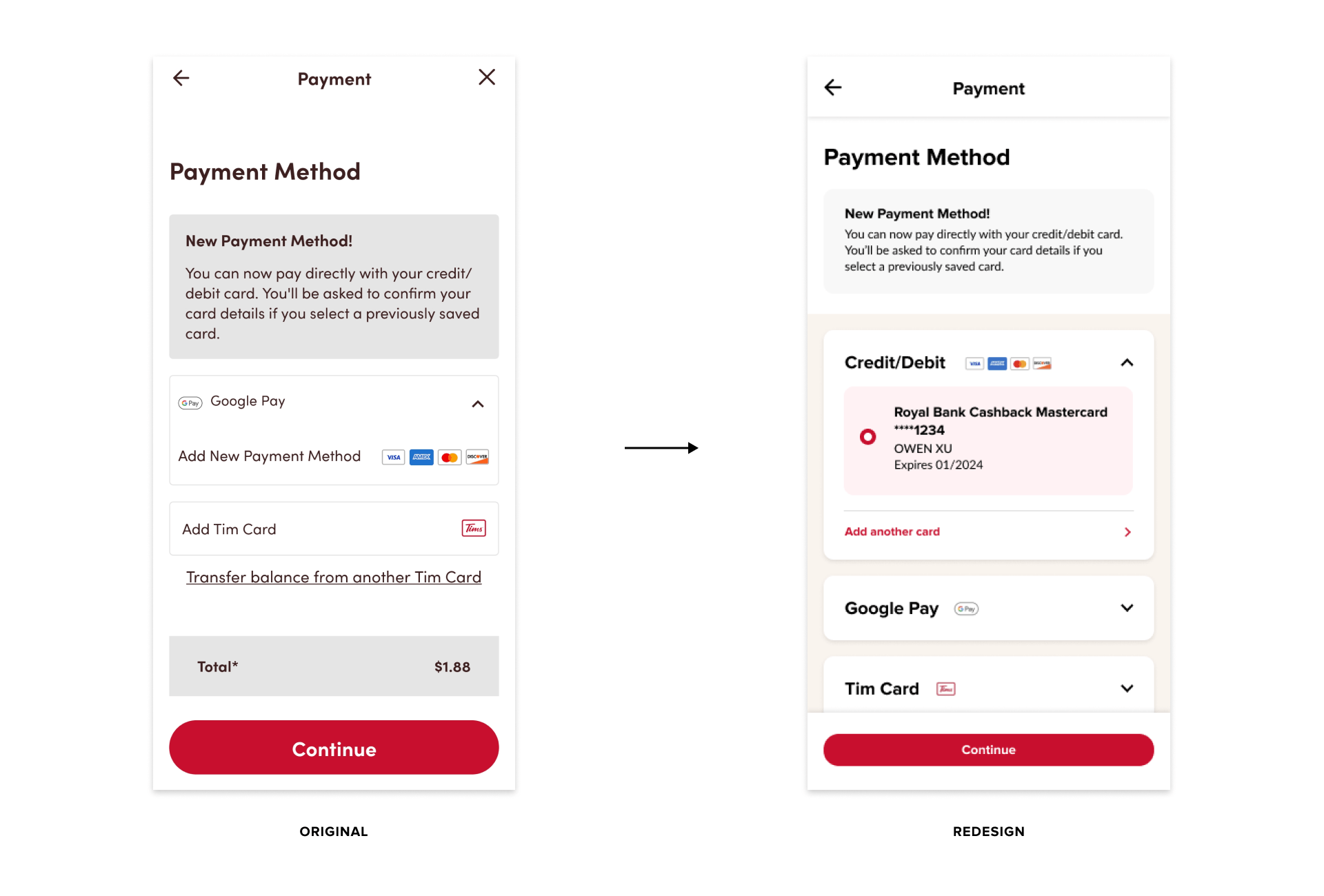
Pinpointed problem(s) on the current Tim Hortons app payment screen:
1. Why is Google Pay the default payment method shown, and the more commonly used Credit Card method second (and hidden) in the dropdown menu?
Proposed solution(s):
Proposed solution(s):
1. The credit/debit card option is now displayed first over the Google Pay and Tim Card options. The view shown above is if a user has saved a card to their profile; if they don’t, only the “Add (another) card” option will be displayed and redirect users to a screen to do so if they choose.
2. The spacing of the“New Payment Method” announcement section has been reduced. While important to relay to users, I felt that seeing the payment method options still takes priority/hierarchy over it.
2. The spacing of the“New Payment Method” announcement section has been reduced. While important to relay to users, I felt that seeing the payment method options still takes priority/hierarchy over it.
What are some problems with
the review screen and what are some proposed solutions?
the review screen and what are some proposed solutions?
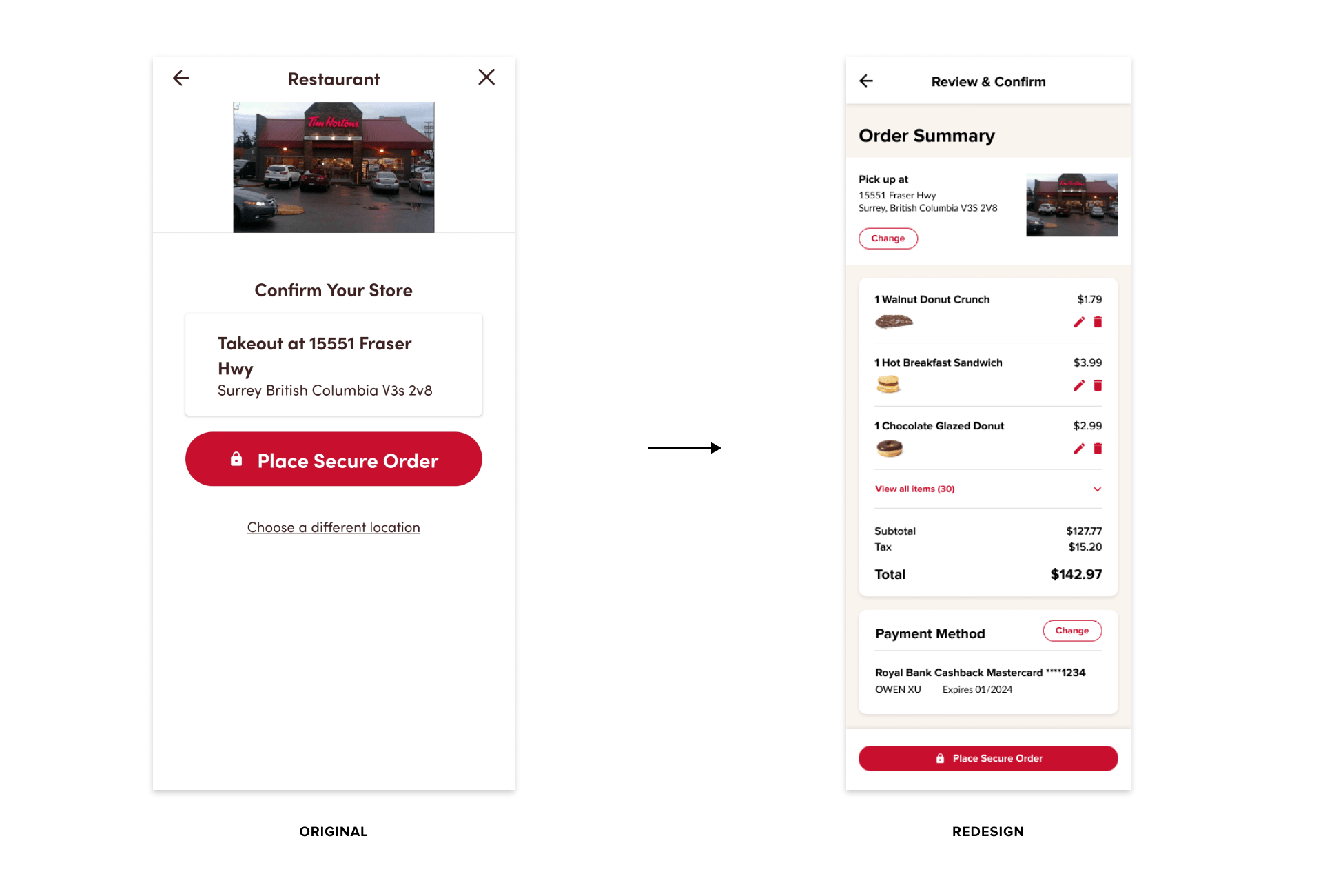
Pinpointed problem(s) on the current Tim Hortons app review screen:
1. The confirmation page is missing a lot of potential information that could be displayed to further help the user in the ordering process (ex. recap of order, payment used, etc.)
Proposed solution(s):
1. An order summary is now displayed (service/address, items in bag, payment method) so users can again have a recap of their order before confirming and placing it.
2. A "View all items” feature has been added if an order is more than the default 3 items displayed. It acts like a menu that expands when clicked on; this is so that users can view all their items but not have it all displayed at once initially (saving space).
3. The “Place Secure Order” button is now in a fixed position at the bottom of the screen to help with navigation and efficiency by (hopefully) reducing scroll time, similar to the “Continue” button on previous screens.
3. The “Place Secure Order” button is now in a fixed position at the bottom of the screen to help with navigation and efficiency by (hopefully) reducing scroll time, similar to the “Continue” button on previous screens.