
Toronto Cupcake
Redesigning their website — a UX case study
Redesigning their website — a UX case study
Overview
In this case study, I analyzed the current state of Toronto Cupcake's desktop website to identify problems and issues, proposing solutions in the process, in an attempt to improve its overall user experience and functionality.
In this case study, I analyzed the current state of Toronto Cupcake's desktop website to identify problems and issues, proposing solutions in the process, in an attempt to improve its overall user experience and functionality.
Roles
UX Designer & Researcher, Student
Date
January 2023 — February 2023
Tools
Figma, InVision, Miro, UXPressia
UX Designer & Researcher, Student
Date
January 2023 — February 2023
Tools
Figma, InVision, Miro, UXPressia
Disclaimer
This case study may contain copyrighted material the use of which has not been specifically authorized by the copyright owner. This case study has helped me to promote my capabilities and advance my education specifically in the area relating to user experience (UX) research and includes my personal opinions, satire, criticism and review. I believe this constitutes a ‘fair use/dealing’ of any such copyrighted material.
This case study may contain copyrighted material the use of which has not been specifically authorized by the copyright owner. This case study has helped me to promote my capabilities and advance my education specifically in the area relating to user experience (UX) research and includes my personal opinions, satire, criticism and review. I believe this constitutes a ‘fair use/dealing’ of any such copyrighted material.
Introduction
Toronto Cupcake is a Canadian gourmet cupcakery in the Greater Toronto Area founded in 2010 by Michelle Harrison. While they’ve accumulated and gained a strong reputation for fresh, delicious cupcakes over the past decade, Toronto Cupcake’s current website is objectively outdated visually and in overall navigation in terms of their online ordering service. These issues may make it difficult for potential new customers to navigate their interface and increases the possibility/chance of losing them due to its confusing nature.
In an attempt to generate and provide solutions on how the website can be improved, I will be employing the 5-step UX Design Process:
Define → Research → Analyze → Design → Validate
Define
Website Analysis
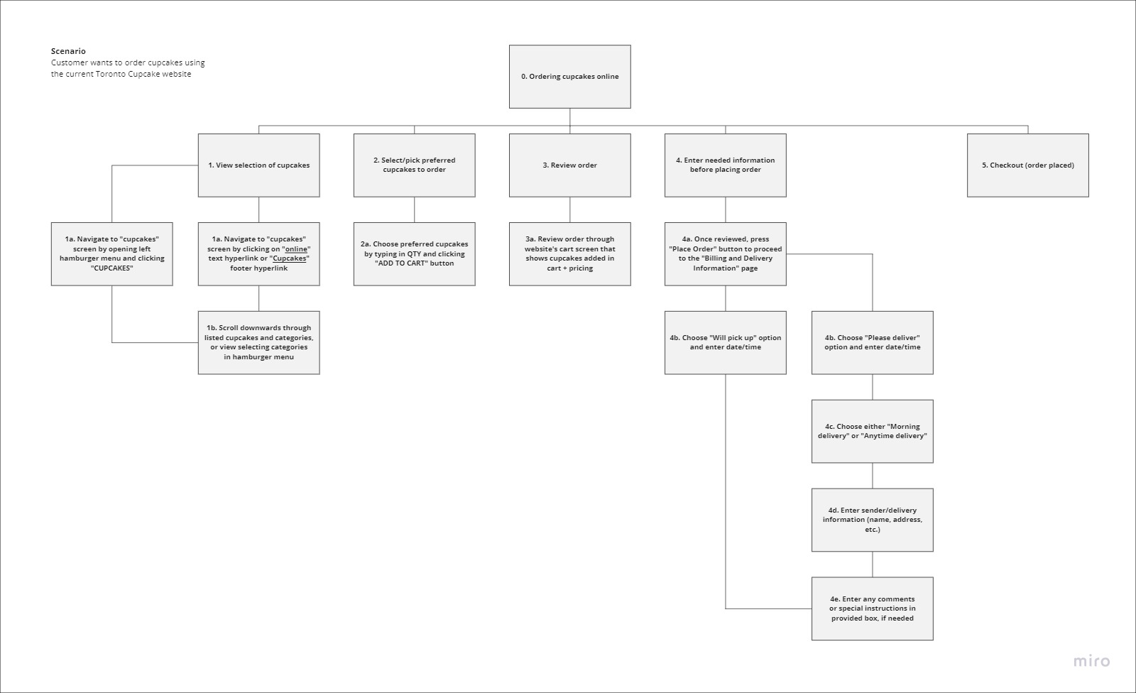
To analyze the website, I drafted a hierarchical task analysis of the main task the website is used for, which is the process of ordering cupcakes. I then analyzed the four main pages I found to do with this process: their home page, cupcakes page, cart page and checkout page.
To analyze the website, I drafted a hierarchical task analysis of the main task the website is used for, which is the process of ordering cupcakes. I then analyzed the four main pages I found to do with this process: their home page, cupcakes page, cart page and checkout page.
Pinpointed Problems
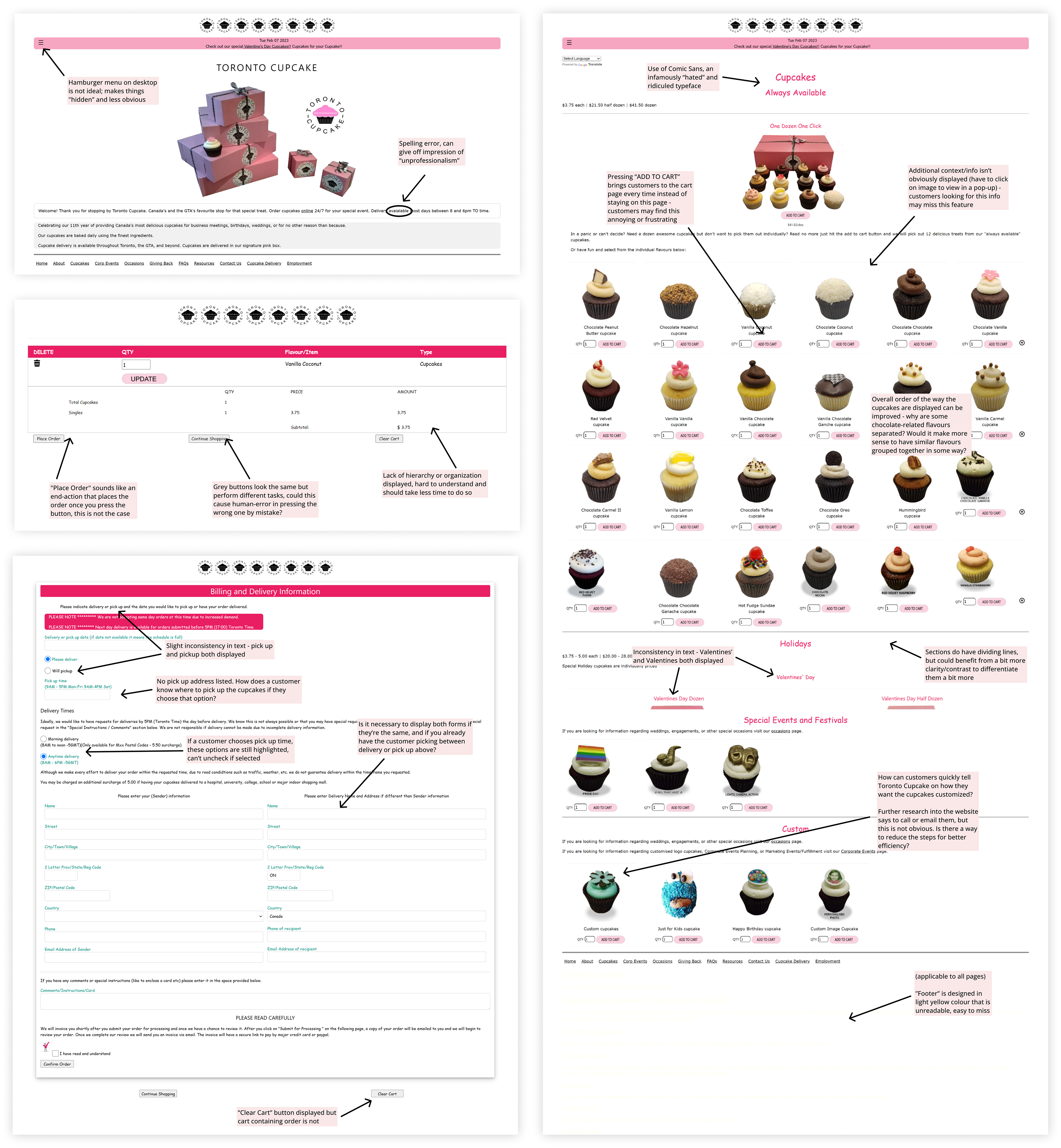
1. The visual web design is unpleasing and can give the impression of “unprofessionalism". This is due to mistakes such as spelling errors. In other words, the overall UI/UX credibility of the website can be improved.
2. The online ordering system is confusing and outdated. Some problems include unorganized cart display information and unconventional payment methods. The challenge here is to make the overall ordering experience for new or returning customers more efficient and less complicated.
Research
Persona
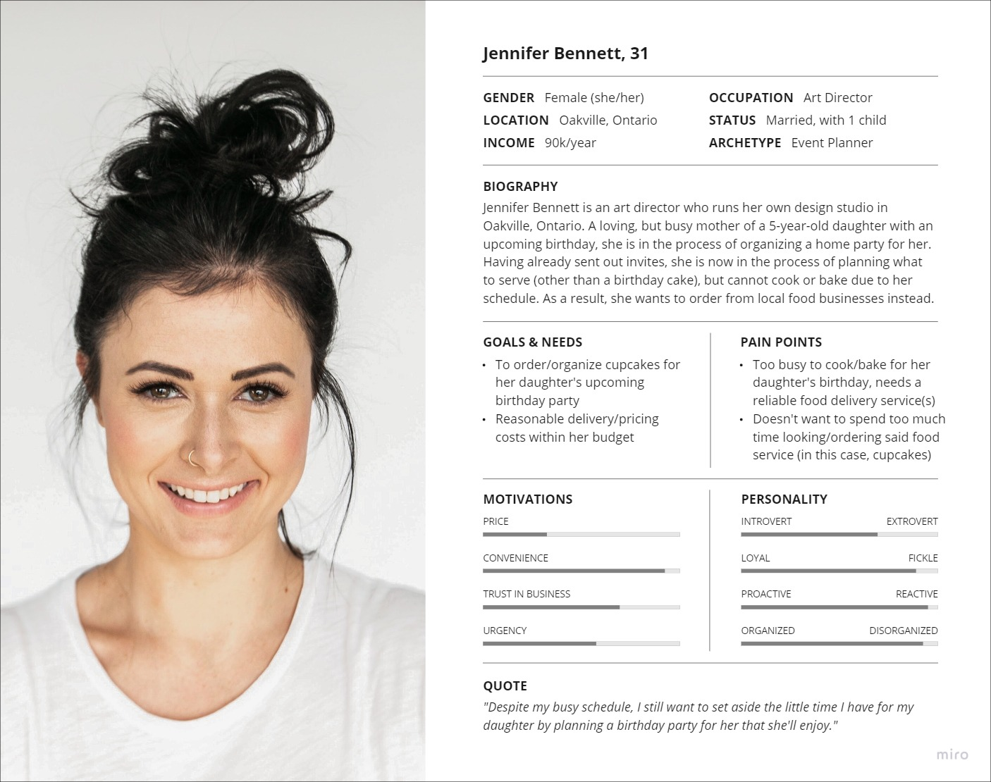
After pinpointing the issues I found on the website in an effort to gain context and empathize with users, I needed to determine who Toronto Cupcake’s users were in the first place. Due to the nature of their services of providing cupcakes for anybody, no matter the reason, I hypothesized that their target audience is relatively broad, but I eventually created a persona based on one of the target audience groups I hypothesized: groups looking to order cupcakes for celebratory events, such as birthdays.
After pinpointing the issues I found on the website in an effort to gain context and empathize with users, I needed to determine who Toronto Cupcake’s users were in the first place. Due to the nature of their services of providing cupcakes for anybody, no matter the reason, I hypothesized that their target audience is relatively broad, but I eventually created a persona based on one of the target audience groups I hypothesized: groups looking to order cupcakes for celebratory events, such as birthdays.
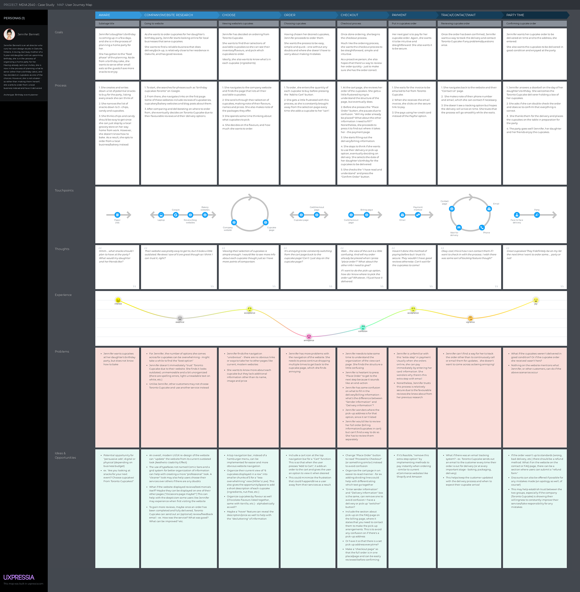
Journey Map
I also created a customer journey map based on my persona in order to discover some pain points they might experience along the way, and generate ideas for possible solutions.
I also created a customer journey map based on my persona in order to discover some pain points they might experience along the way, and generate ideas for possible solutions.
Analyze
Competitor Analysis
I then did a competitor analysis comparing Toronto Cupcake with three other cupcakeries/bakeries with online ordering in the Greater Toronto Area. This method not only served as a way for me to gain inspiration but also as a way for me to identify common website practices. This was also to see if I could apply them to and/or improve upon them with my re-design.
I then did a competitor analysis comparing Toronto Cupcake with three other cupcakeries/bakeries with online ordering in the Greater Toronto Area. This method not only served as a way for me to gain inspiration but also as a way for me to identify common website practices. This was also to see if I could apply them to and/or improve upon them with my re-design.
The three competitors I analyzed were:
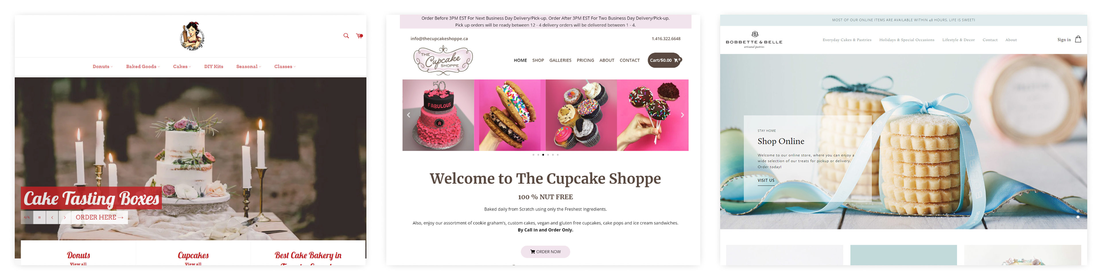
Common design features #1: Top navigation bar with cart placement on the right, has eye-catching hero message
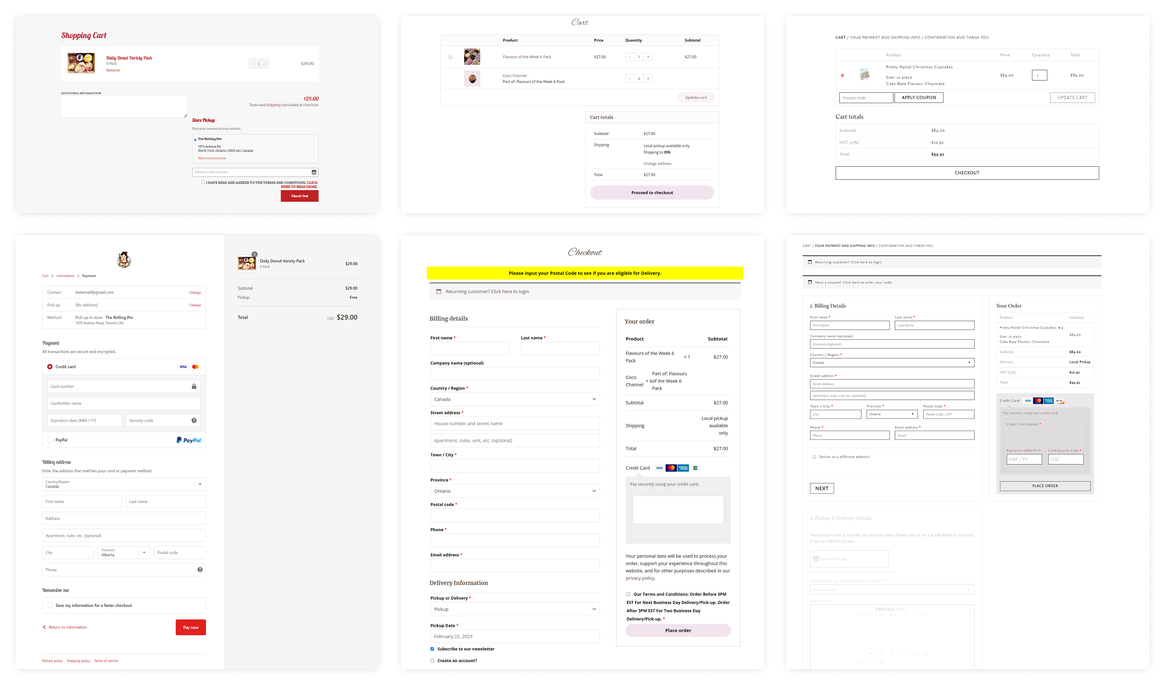
Common design features #2: Similar cart and checkout page layouts
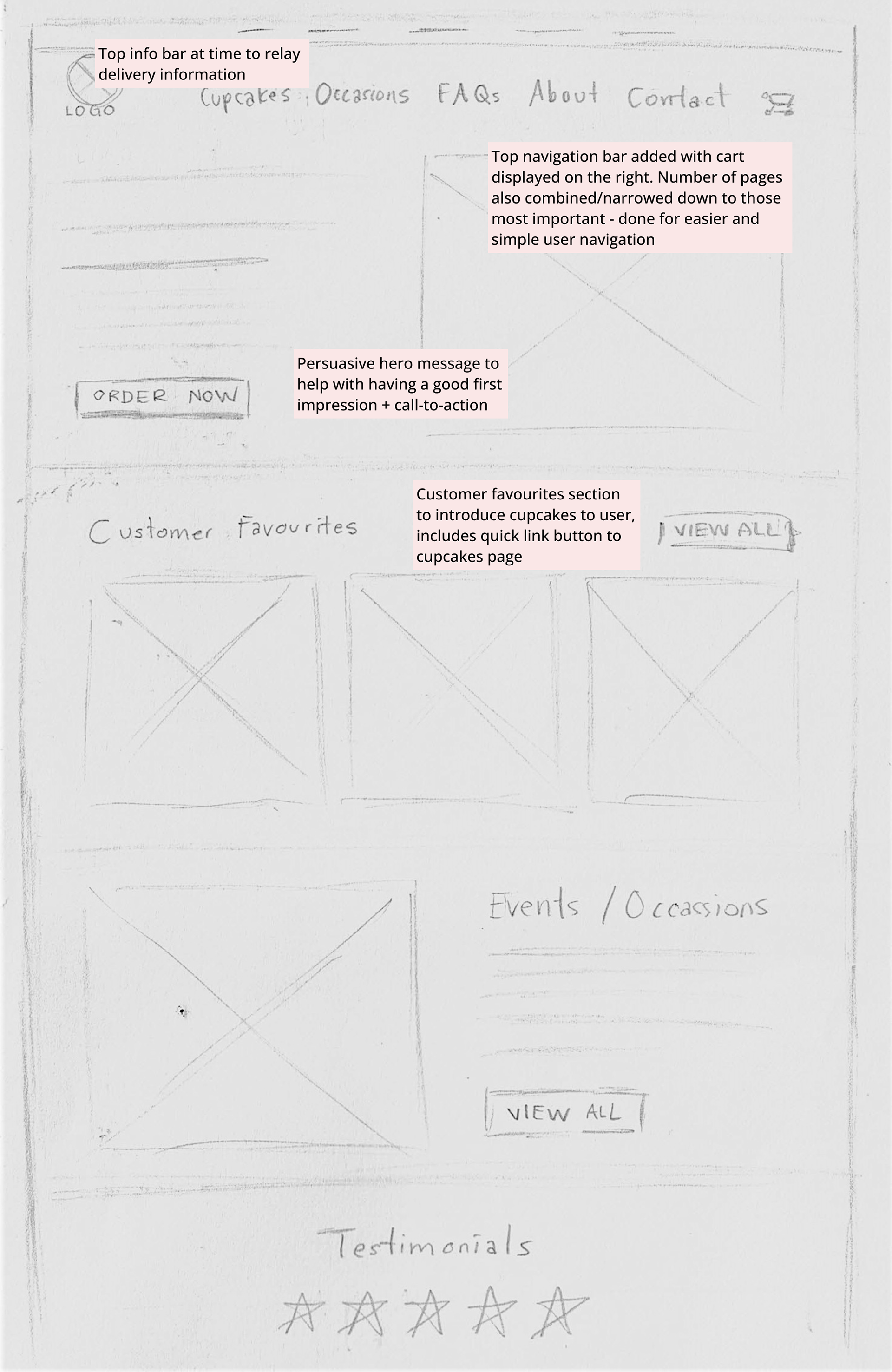
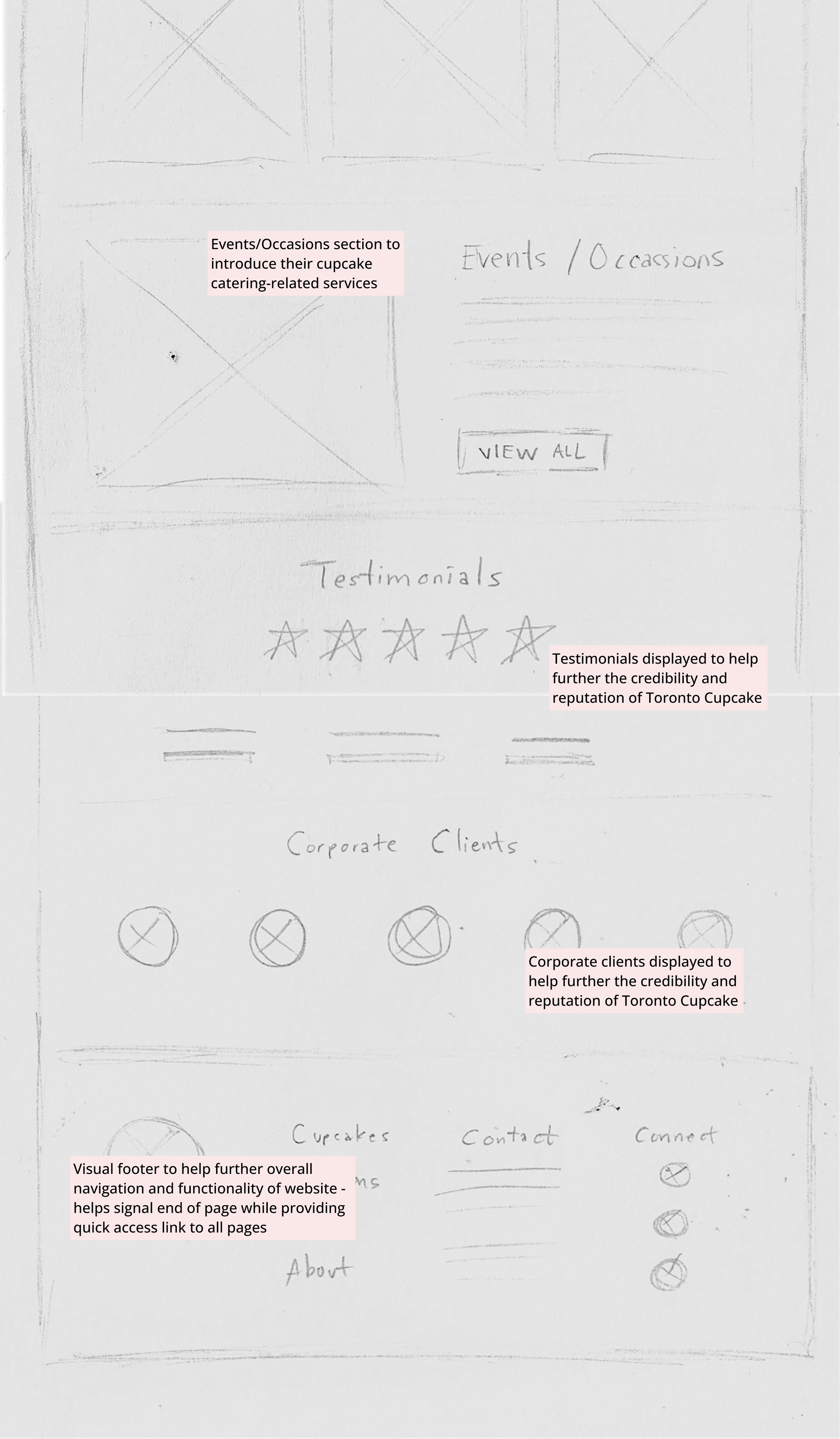
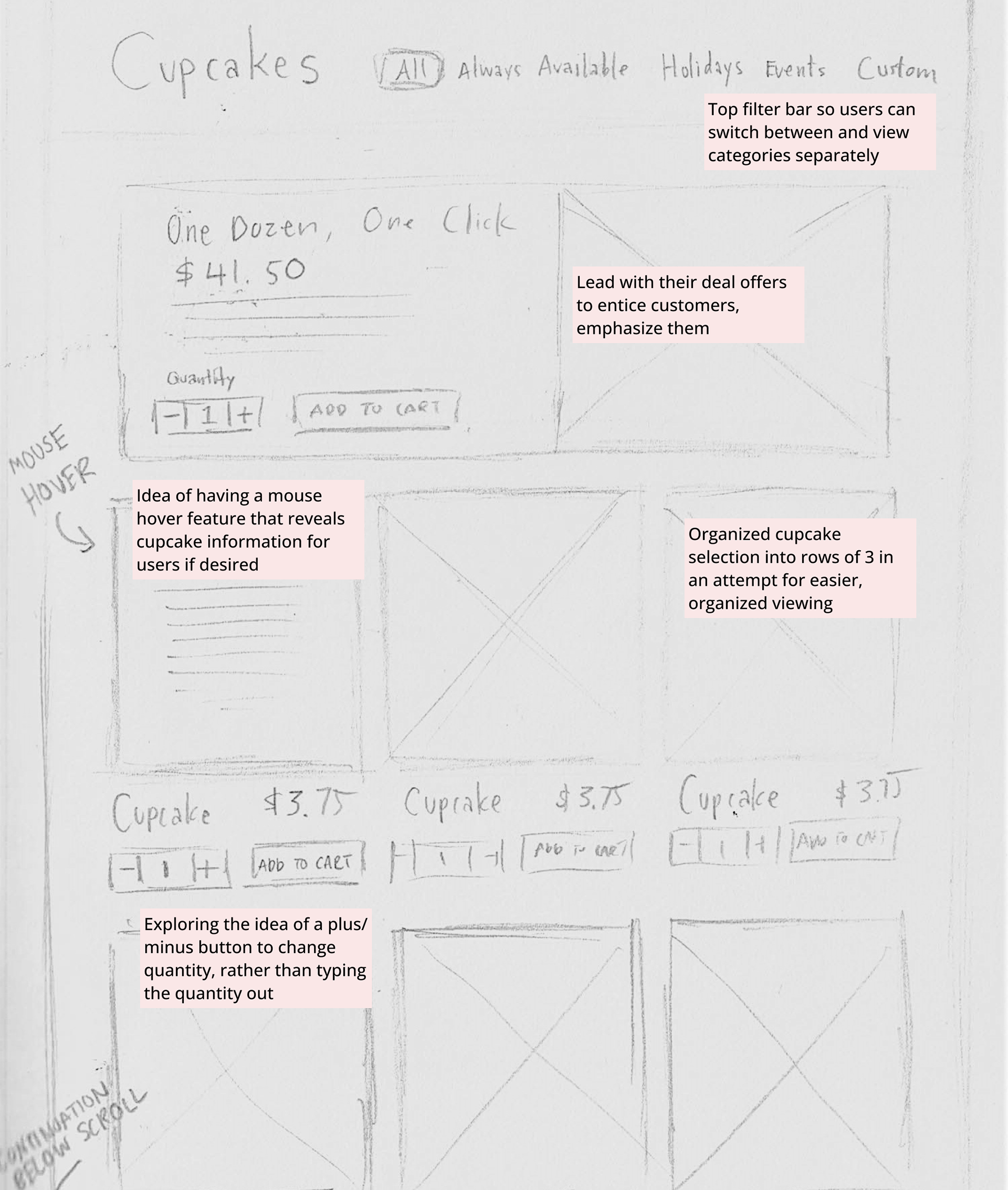
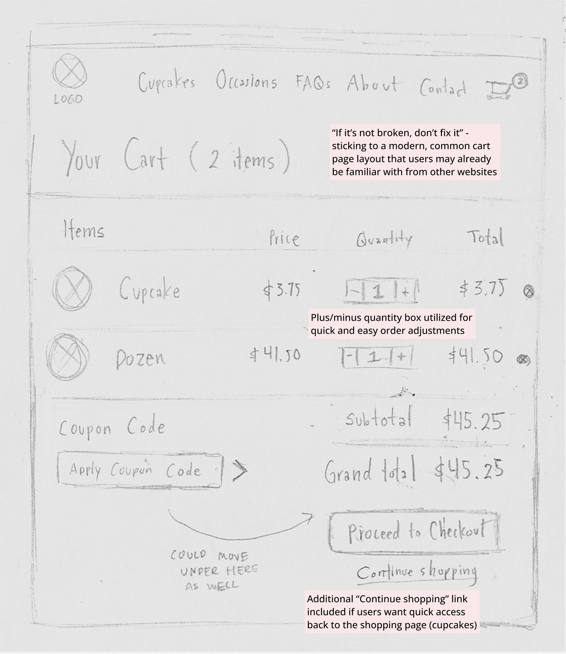
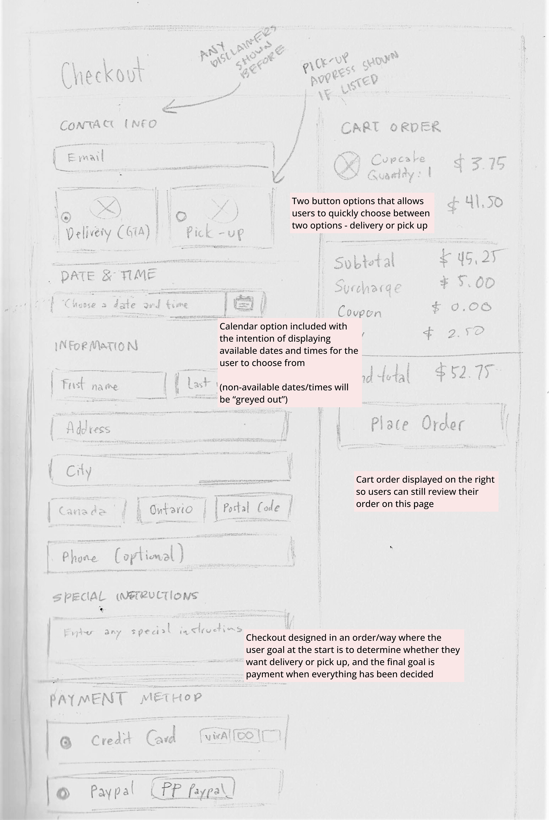
Low-Fidelity Wireframes
With some ideas & opportunities in mind, gathered from doing the journey map and competitor analysis, I planned out and ideated some designs in an attempt to solve some of the problems, previously identified, on Toronto Cupcake's current website; and to do so, I created low-fidelity wireframes.
With some ideas & opportunities in mind, gathered from doing the journey map and competitor analysis, I planned out and ideated some designs in an attempt to solve some of the problems, previously identified, on Toronto Cupcake's current website; and to do so, I created low-fidelity wireframes.

Design
High-Fidelity Mockups
After drafting the low-fidelity wireframes, I created high-fidelity prototypes using Figma and InVision. It was during this process that I began bringing some of the proposed solutions I outlined during the ideation phase "to life" and in a more organized and attractive manner.
After drafting the low-fidelity wireframes, I created high-fidelity prototypes using Figma and InVision. It was during this process that I began bringing some of the proposed solutions I outlined during the ideation phase "to life" and in a more organized and attractive manner.
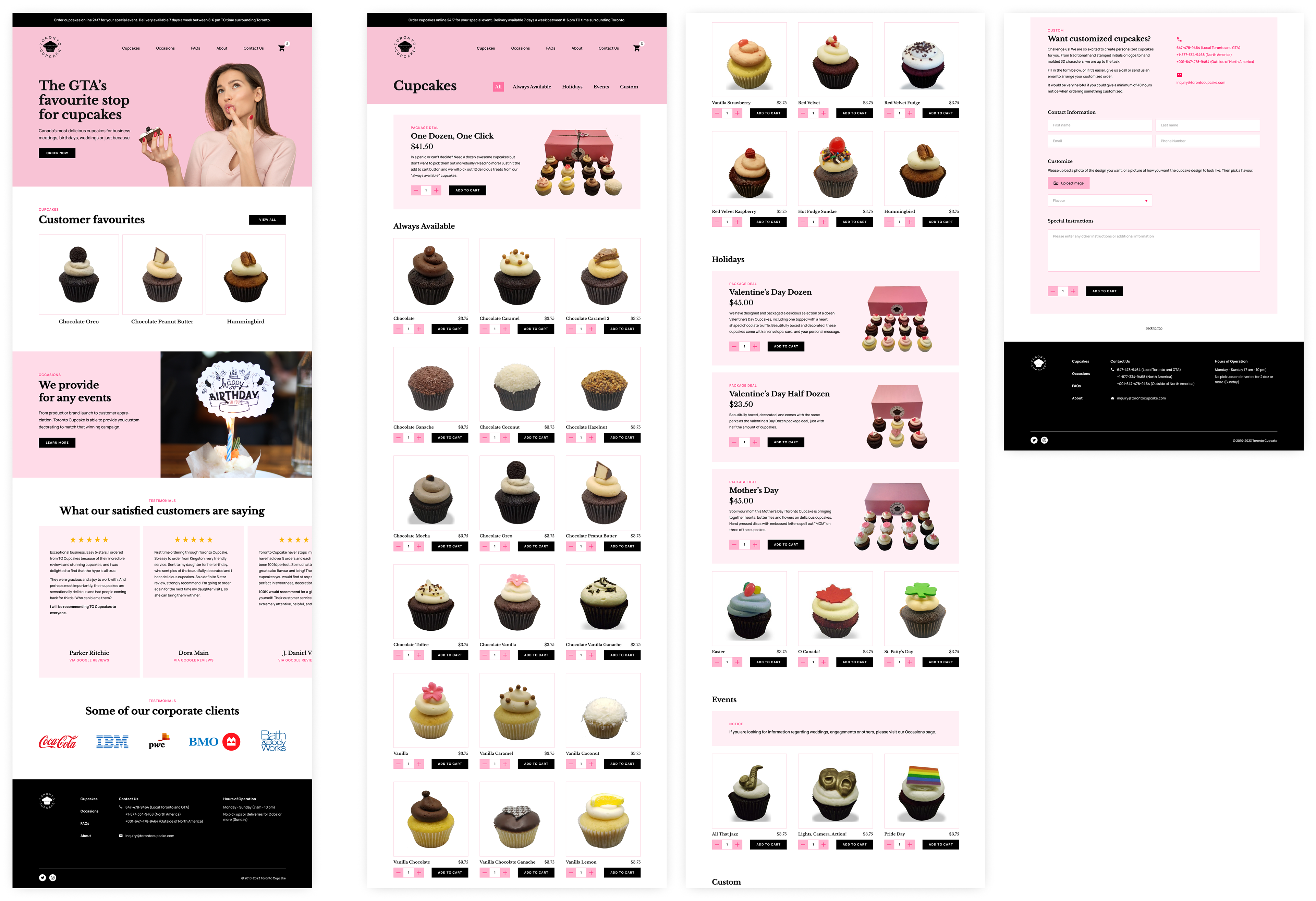
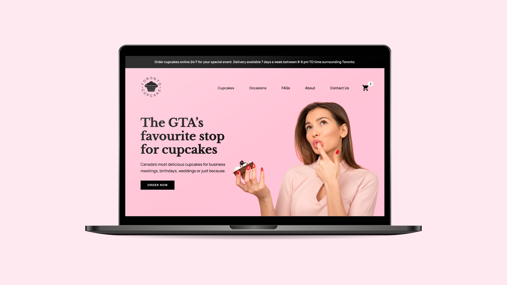
Home Page and Cupcakes Page
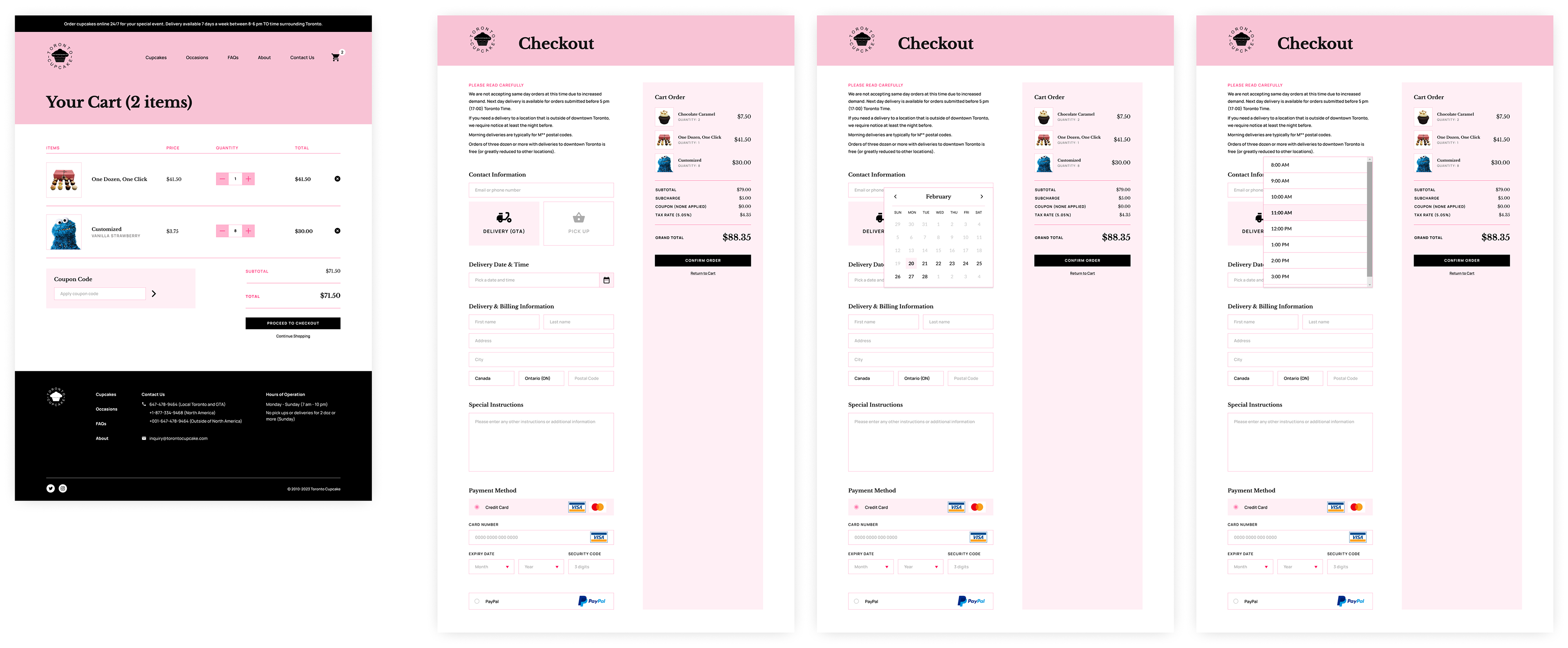
Cart Page and Checkout Page
Some Proposed Solutions
1. Aesthetic-Usability Effect: Revamp UI by further implementing consistent branding, feature testimonials on the home page to improve credibility and trust with users, and have the addition of a persuasive hero message to leave a good first impression.
2. Jakob's Law: Re-design certain layouts, such as the cart and checkout pages, in a similar fashion as other websites; utilize a top navigation bar system for easier and simpler overall site navigation. This is to have the user focus more on concentrating on the task in front of them rather than having to learn a new model.
Validation
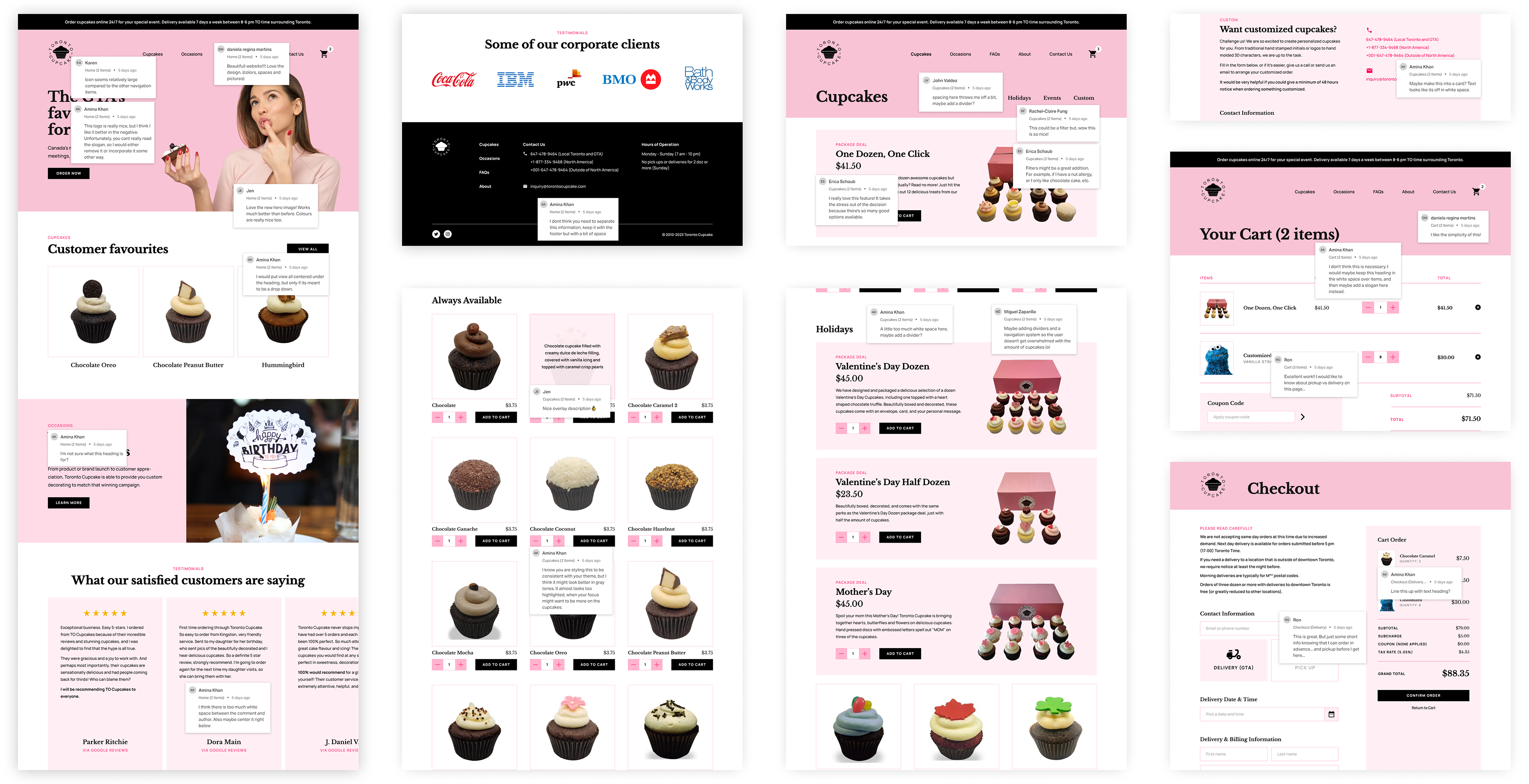
Website Prototype Testing
Once I re-designed the four Toronto Cupcake pages with my proposed solutions, I prototyped them using InVision. This was to make it testable by simulating how the flow would work if it were a live website and prepare it for user testing.
Once I re-designed the four Toronto Cupcake pages with my proposed solutions, I prototyped them using InVision. This was to make it testable by simulating how the flow would work if it were a live website and prepare it for user testing.
By doing this step, I'm able to receive crucial feedback on my proposed design solutions and identify any areas of improvement or errors. This rinse-and-repeat process will allow me to further work on improving the experience of the website.
Takeaways
Next Steps
The next steps for this Toronto Cupcake website project, if it weren’t a month-long case study assignment, would be to carry on with the validation phase by continuing user testing. Ideally, a bigger scope of user testing should be done with a larger sample size in order to gain more perspectives. From there, continuous refinement to the high-fidelity prototype should be done in order to further improve the user experience of the website, specifically for the process I covered in this case study (ordering and checkout).
The next steps for this Toronto Cupcake website project, if it weren’t a month-long case study assignment, would be to carry on with the validation phase by continuing user testing. Ideally, a bigger scope of user testing should be done with a larger sample size in order to gain more perspectives. From there, continuous refinement to the high-fidelity prototype should be done in order to further improve the user experience of the website, specifically for the process I covered in this case study (ordering and checkout).
What I Learned
This case study assignment was my first stepping stone in further exploring the world of UI/UX. As a visual designer who did his undergraduate degree in Communication Design, user experience design has always interested me and is a field I may want to work in. I’ve learned a lot from doing this case study, the main points being:
This case study assignment was my first stepping stone in further exploring the world of UI/UX. As a visual designer who did his undergraduate degree in Communication Design, user experience design has always interested me and is a field I may want to work in. I’ve learned a lot from doing this case study, the main points being:
1. Collaboration is highly important: Working towards improving user experience is not possible by working individually because, by definition, you’re designing for others and not just for yourself. Gaining as many perspectives and feedback from others, whether they be aspiring UX designers/students or target audience groups, is crucial.
2. UI/UX is a continuous process, not just a technique: The world is continuously changing and as UI/UX designers, we need to continuously be on the lookout for ways of improving user experience, even if the design is already in a good spot.
3. Research is a must: In order to design for something, you need to know all about its contextual information. Without doing so, you risk not drawing valid solutions. I thought this case study served as a good reminder of how important research is.